Great Lakes Yard
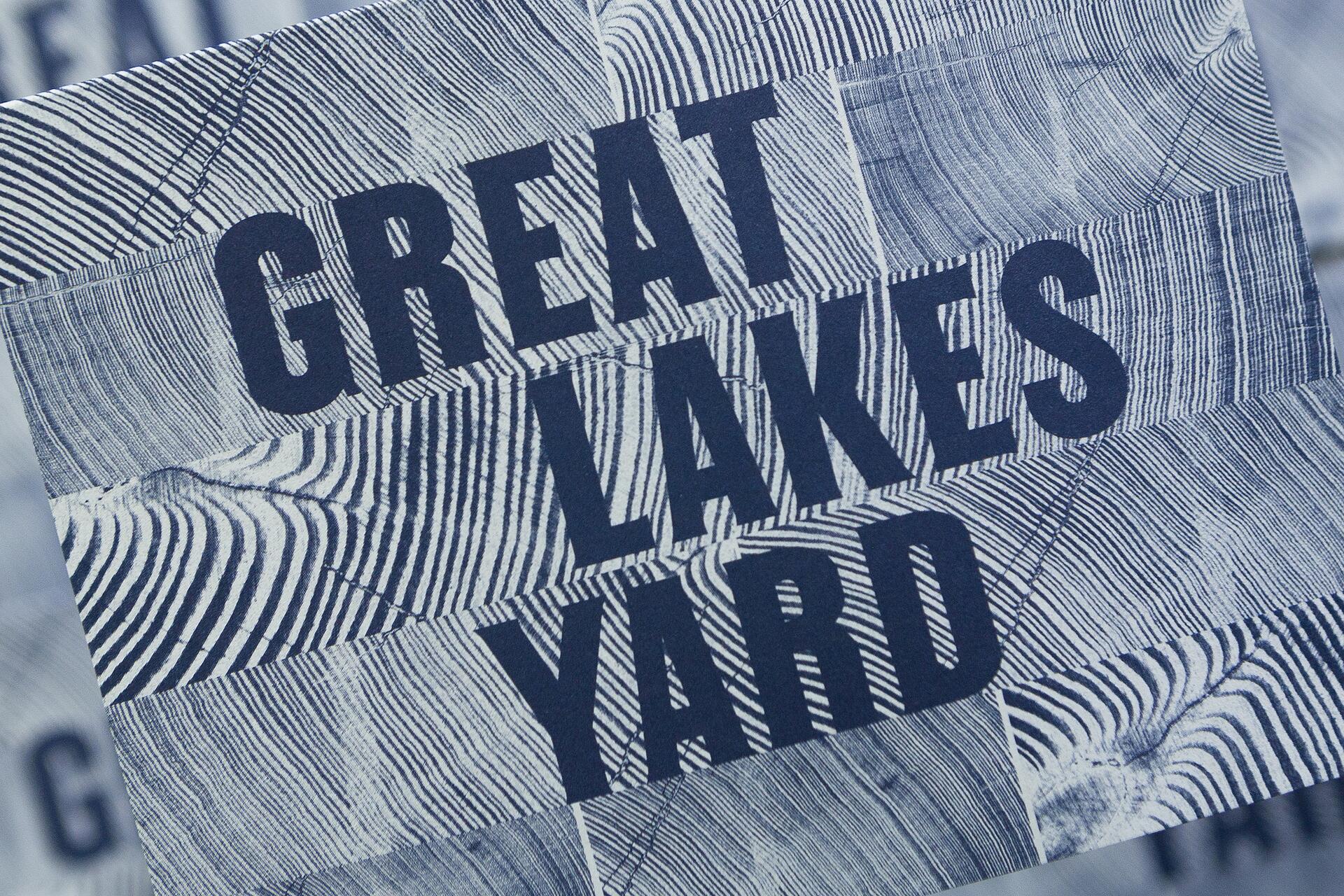
Knowing the importance of tradition, craft, and region to Great Lakes Yard—turn of the century American printing-type would be a starting point. The forms spanned the 1850’s to 1930’s, crafted with character and visual impact in mind, these letters exemplifying Western culture and American Industrialization.
The type specimens looked to for structural inspiration were of the Gothic classification that informed but predated Grotesque typefaces. These turn of the century Gothic types focused on impactful headlines in adverse conditions, as that was what the era’s technology provided. These factors rendered machined-like qualities in the letters that created a feeling of being time-tested, strong, proven, and again uniquely American.
Railroad Gothic served as the main specimen these forms were historically and structurally based on. Designed in 1906 for American Type Founders, it’s an uppercase-only typeface that is very condensed and heavy, giving it a distinctive 19th century American wood type feeling. Originally designed for use in railroad signage, Railroad Gothic is best used when set really big.